Project Overview
In a time where entertainment is at an all-time high, consuming media across various platforms can feel both overwhelming and isolating at the same time. As someone who watches shows on various platforms, I strived to create an app that consolidated all my TV show activity in one place while building a bridge for users to connect with others who enjoy the same shows.
The Problem
The last thing anyone wants to do after a long day is scroll endlessly on their streaming services for a show to watch, search endlessly for where they left off, or lose track of what they’ve already seen.
There are too many choices to make and a lack of connection between users who watch the same shows.
44%
of streamers say they often have a hard time finding something to watch — mntn research
61%
of viewers said streaming services helped them discover shows they wouldn't have watched — mntn research
The Solution: Show Vault
Show Vault is a social platform that aims to provide a dedicated space for TV show enthusiasts. Users can keep track of what they're watching in one place by connecting their subscribed streaming services all into one app. Show Vault aims to help shoulder the decision overload, act as your personal show log, and bring users together who are part of the same fan base.
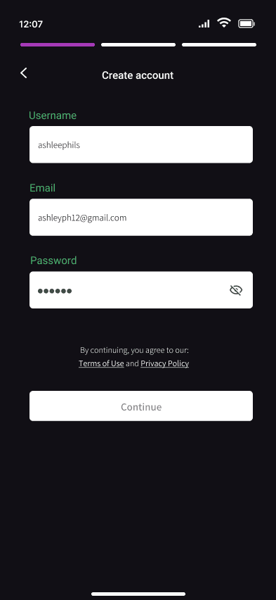
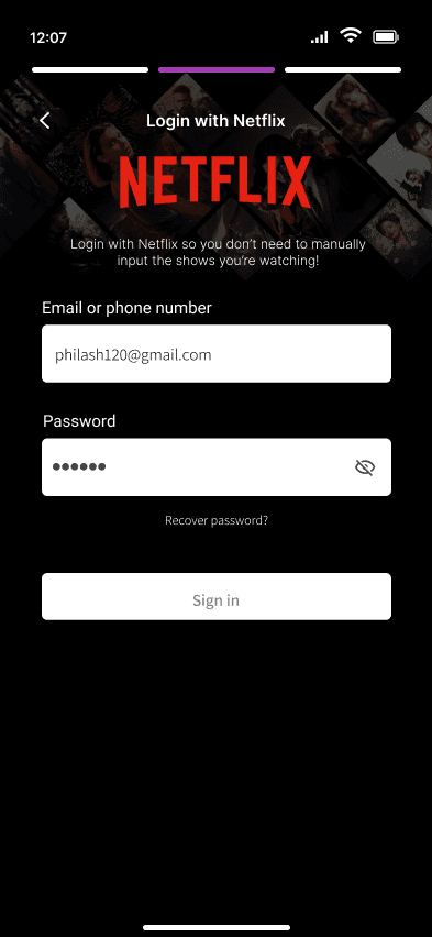
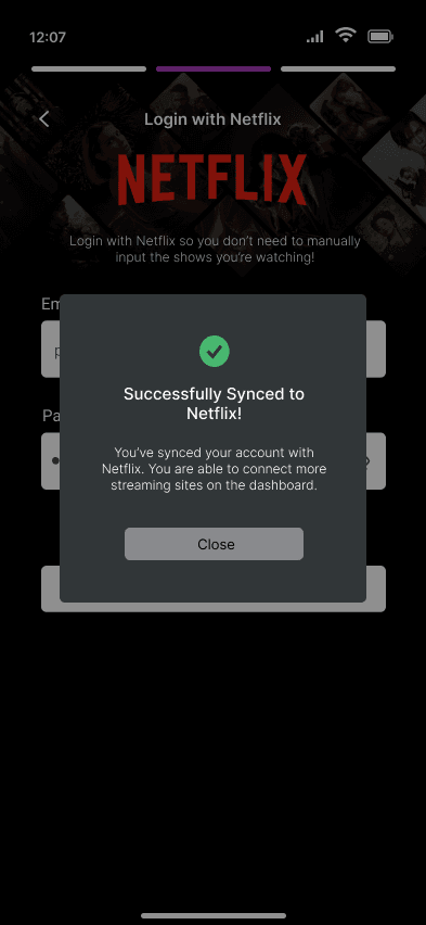
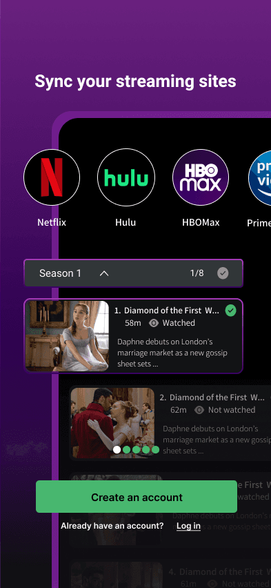
Seamless Onboarding
A social platform that aims to provide a dedicated space for TV show enthusiasts. Users can keep track of what they're watching by connecting their subscribed streaming services all into one app.
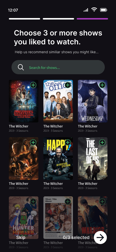
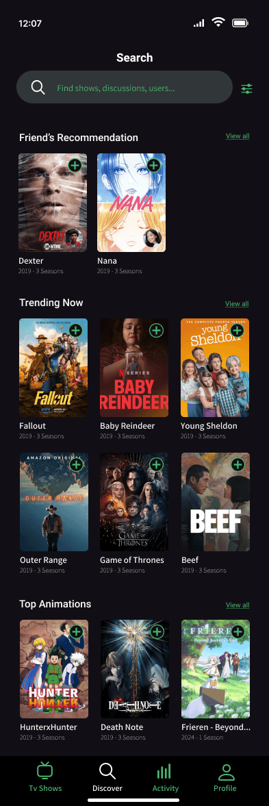
Discover New Shows
A social platform that aims to provide a dedicated space for TV show enthusiasts. Users can keep track of what they're watching by connecting their subscribed streaming services all into one app.
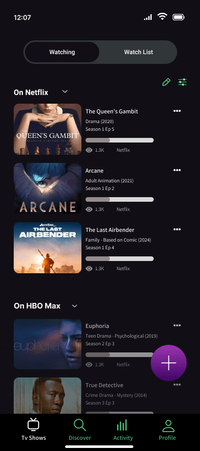
Review Shows & See Friend Activity
A social platform that aims to provide a dedicated space for TV show enthusiasts. Users can keep track of what they're watching by connecting their subscribed streaming services all into one app.
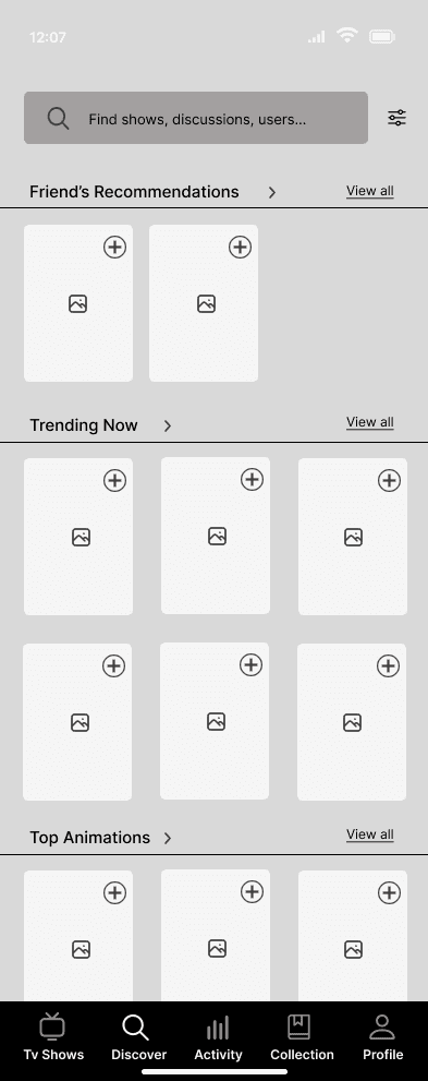
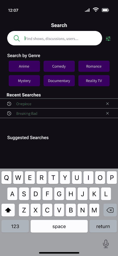
Discover
My Initial Assumptions
Once I pinpointed the problem space to address, I documented my initial assumptions then conducted competitor analysis and user interviews to validate my current hypotheses.
Users would benefit from an app that will help keep track of the shows they are watching and have watched
Users want to talk to their friends about the shows they are watching
Competitor Analysis
Looking at existing apps was essential to identifying any gaps and exploring interesting features that are already in the market. This research not only helped to inspire my own product but also motivated me to create ONE SUPER PRODUCT.

TV Time

Letterboxd

Story Graph
Strengths:
Clear section for trending & new shows
Ways to log personal viewing and reviews
Curated lists for user discovery
User Interviews
Before jumping into design work, I conducted user interviews to understand people’s current watching habits. I hoped to identify any common pain points and gather any insights on their TV consumption.
Key Takeaways: 🔎
Connection and Community
Interviewees have a strong desire to talk to others about the shows they are watching, even looking to social media and online forums for a sense of connection

60% of interviewees lurk on online forums to look up other people's reactions, thoughts, and opinions
"I like the communal environment and how we feed into each other's excitement"
"I look for validation if others have the same opinion, especially if I'm watching a show alone"
Friend's > Critics
Interviewees value the recommendations their friends have over tomato scores and critic reviews.
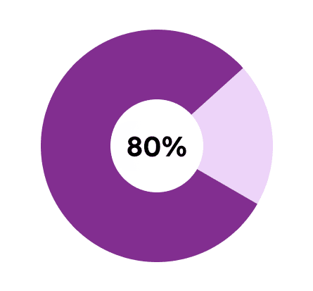
80% of viewers said they are more influenced to watch a show if their friend recommends it to them
"I'm easily influenced by my friend's preferences, if they like something I'll probably like it"
"I don't trust critic ratings, I rather have a friend vouch for the show first"
Although they relied on the individual streaming service to keep track of the shows they're watching, they were overwhelmed with the amount of options available to them. There are too many shows, platforms, and updates to keep track of.
Users need a tool to help organize their viewing experiences and help shoulder decision paralysis while providing ways to interact with one another.
Ideation
How can we address their problems?
To help narrow down the possible solutions, writing How Might We statements (HMWs) allowed me to focus on the foundation of the app first.
How might we personalize recommendations for TV show watchers based on their preferences and viewing history?
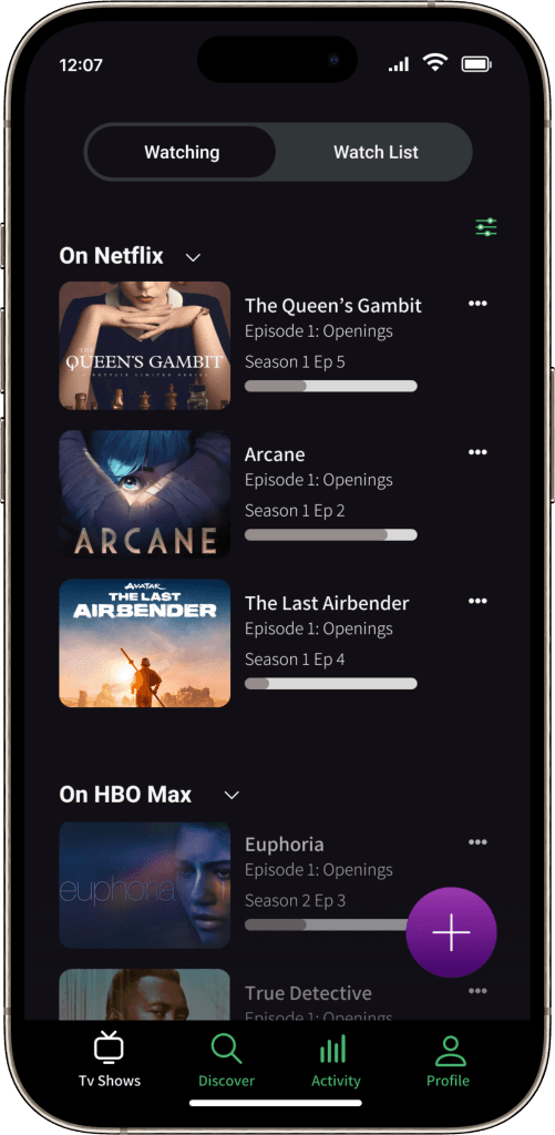
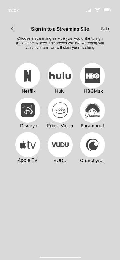
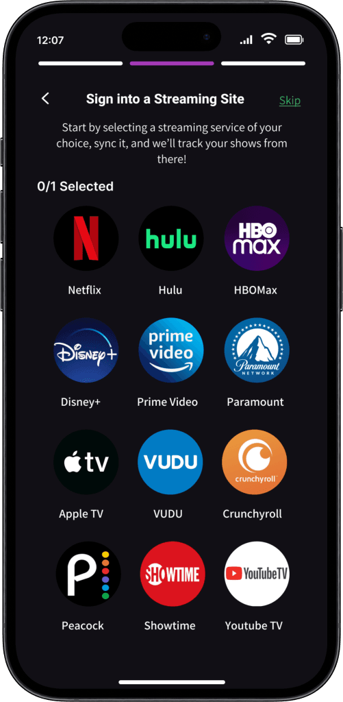
User Flow 1: Onboarding - Connecting Stream Service

How might we incorporate social elements to allow TV show watchers to see what their friends are watching and recommending?
DESIGN
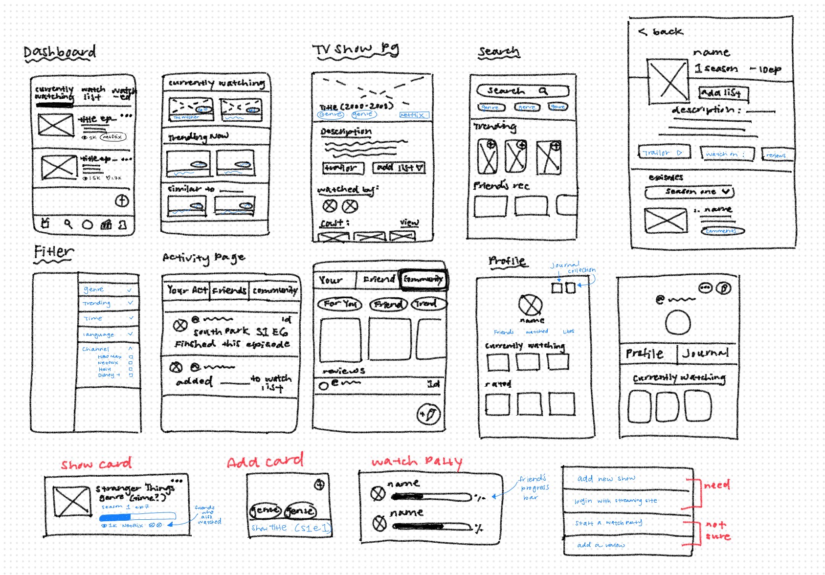
Sketching to Digitizing
The next step involved sketching various versions of the essential screens required to complete the user flows. After finalizing the sketches, I selected ones to digitize in Figma and develop into mid-fidelity wireframes.
In order to conduct my first round of usability testing, I created a working prototype from my mid-fi wireframes. This allowed me to evaluate the core functionality of the user flows before progressing to high-fidelity designs.
Given the time constraints, I wasn’t able to incorporate a community feature into the current prototype. I decided to revisit this by asking my participants about their expectations and preferences when using community features on an app. I hoped that hearing their answers would give me direction on what to implement.
Mid-fidelity Usability Testing
I reached out to five participants and had them test three separate tasks while moderated over Zoom, Google Meet and Discord. My goals were to:
Determine if the current flow is straightforward and easy to understand
Identify if there are any parts of the flow that users think are missing from the current design
Identify what community features users expect out of an app
Although the testing went well, I ended up with more questions than answers....
During onboarding, users thought connecting streaming services was unclear
Users liked the confirmation windows to reassure them their action was successful
Mixed opinions when asked what they expected to see on the community pages
Users liked how there were different ways to “add a show” into their watchlist
Users questioned where they could revisit their reviews after publishing it
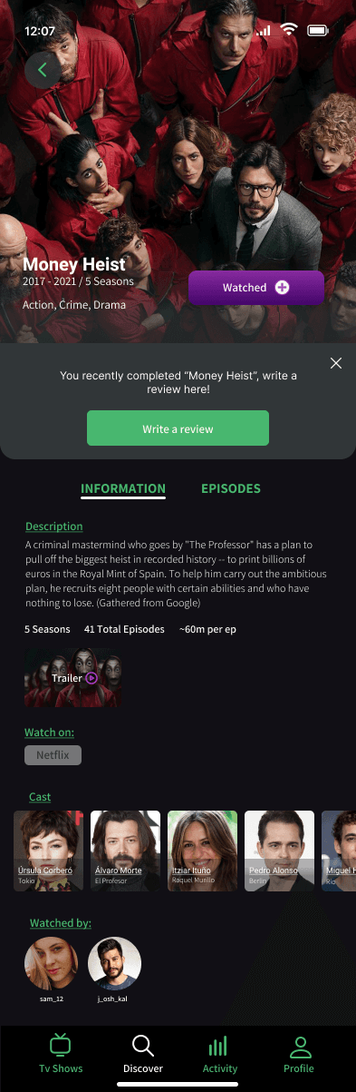
Users liked how they were prompted to review a show after they finished it
After usability testing, I was left with multiple questions on how to proceed with the project. The participants had varied opinions on the community aspect, resulting in no clear consensus.
There were also logistical things that needed to be addressed:
Where would users expect to be able to sync additional streaming sites after the initial onboarding? What about the reviews? Where would the community tab be? Who would be able to read their reviews?
This left me with the overarching question:
Was this app meant primarily for personal use or designed as a social app to foster community? I wanted it to be BOTH!
HI-fi Wireframes
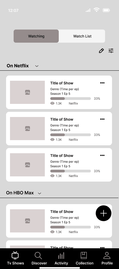
Following the updates and revisions to my mid-fi prototype, I moved on to developing high-fidelity wireframes to bring my vision to life. Utilizing my component library allowed me to efficiently build the prototype and prepare for the next round of testing. I also designed the activity, collection, and profile screens to gather user feedback.
ONBOARDING:

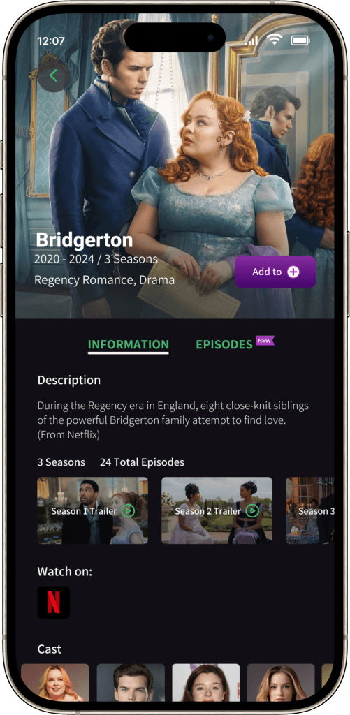
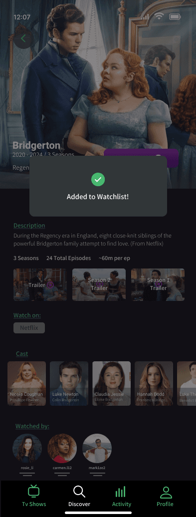
ADDING A SHOW INTO WATCHLIST:
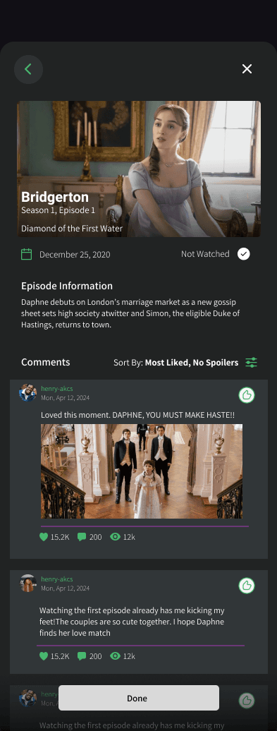
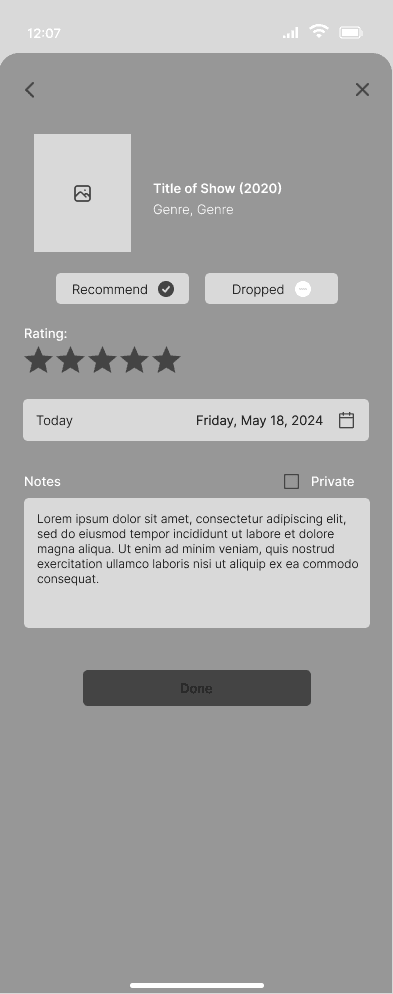
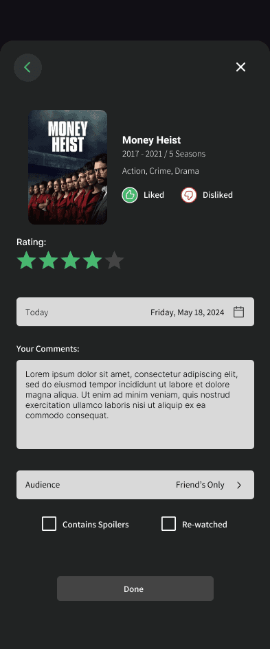
WRITING A REVIEW:
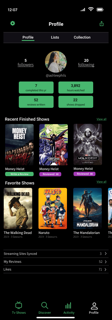
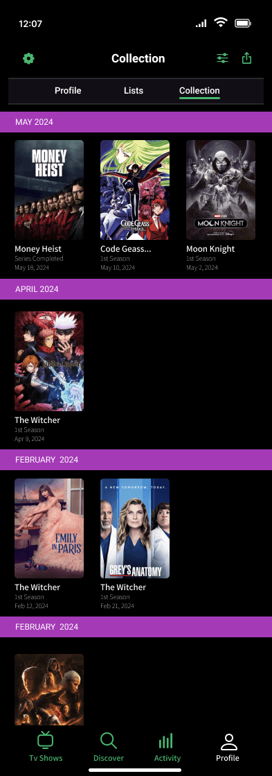
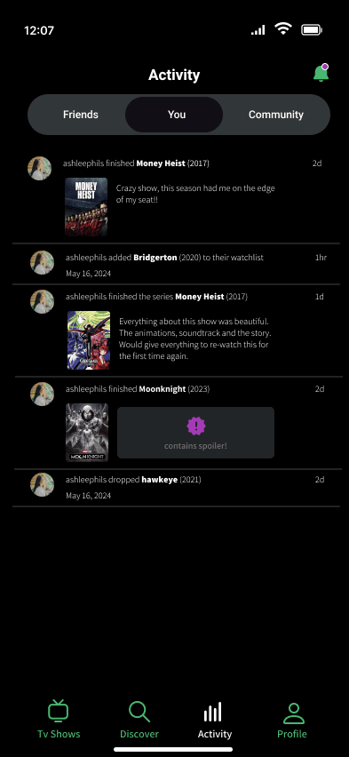
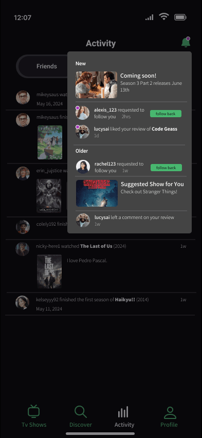
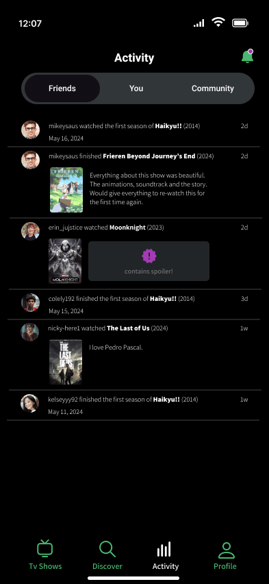
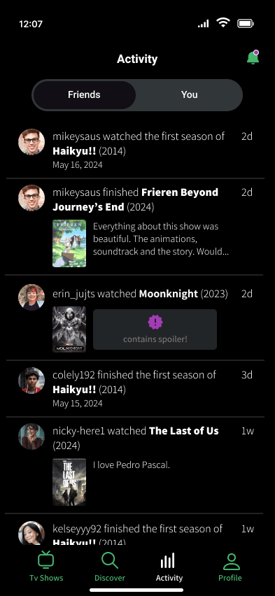
ACTIVITY PAGES:
Hi-fi Usability Testing
I contacted six participants for my final round of usability testing, using the same task flows as before and inviting any type of feedback. All the participants thought the tasks were straightforward and completed the tasks effortlessly. Here is what they had to say:
Overall text is VERY small, couldn’t read
Some inconsistency in some parts of the design. ie: some buttons look disabled
Onboarding screens TELL the users what to expect from the app but doesn’t SHOW it well
Some screens looked crowded due to the amount of info presented
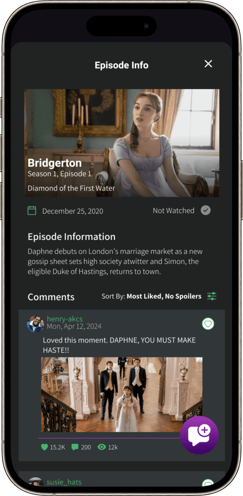
Users misinterpreted the purple episode dot to refer to episodes they haven’t seen
Thoughts Going Forward
Participants raised questions about...
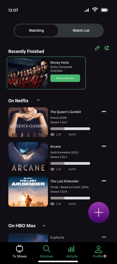
The purpose / differences between the “Recently Finished” pop-up on the dashboard and the “Collection” page
What if a user is not subscribed to ANY streaming services? Would they still be able to use the app?
I figured I needed to think more about the logistics of how users would interact with my app’s features and revisit my user personas to remind myself of my targeted audience.
ITERATIONS
Taking in the feedback from the usability testing, I worked on making revisions to my product. I mainly focused on making everything more accessible. Whether that was color contrast, button sizing, readability of the text. There were many technical changes, but not as much with the functionality of the product.
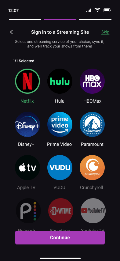
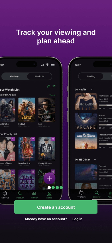
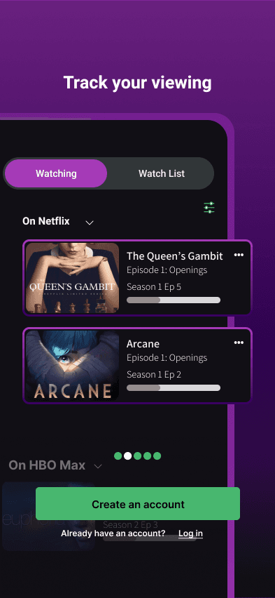
Onboarding Screens
The previous onboarding screens didn’t properly emphasize the app’s key features. To change this , I highlighted specific key elements and made them POP OUT more for the user to see.
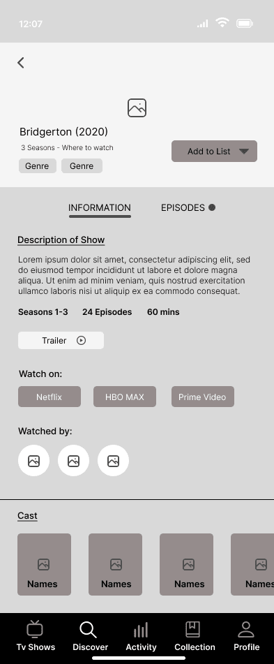
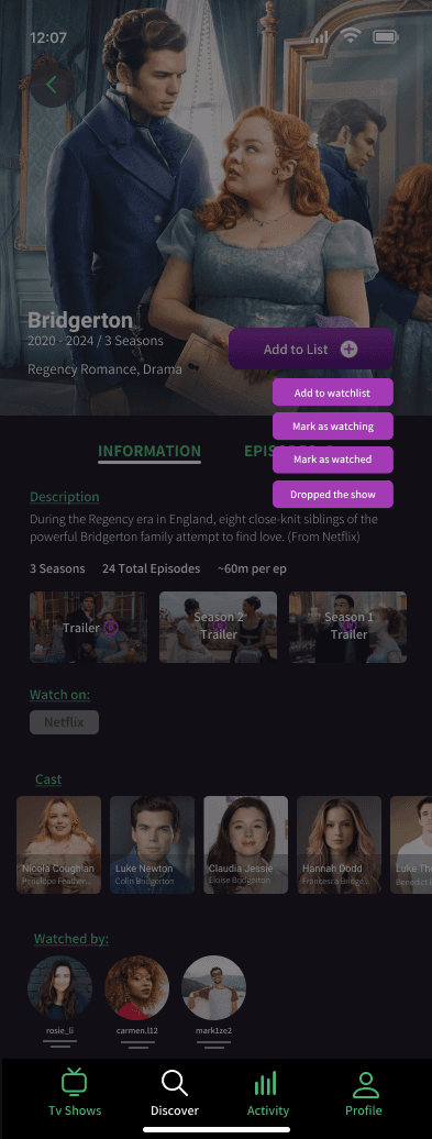
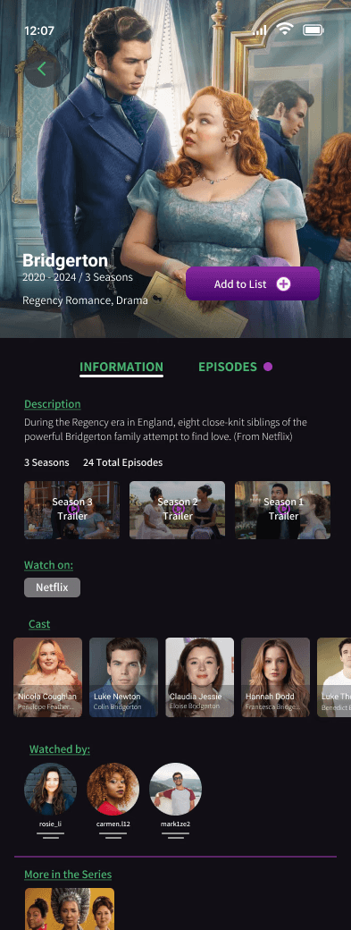
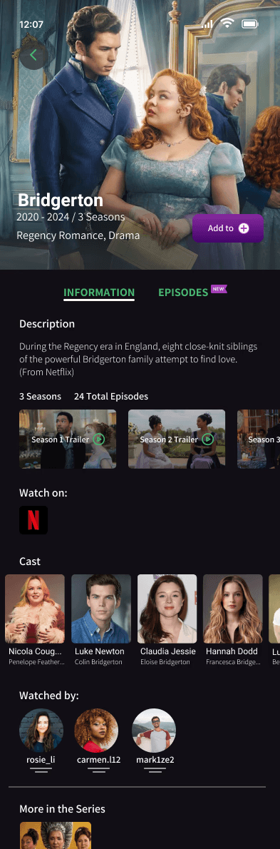
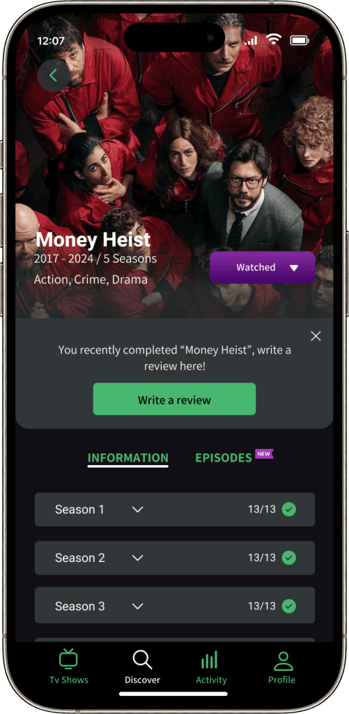
Show Info Page
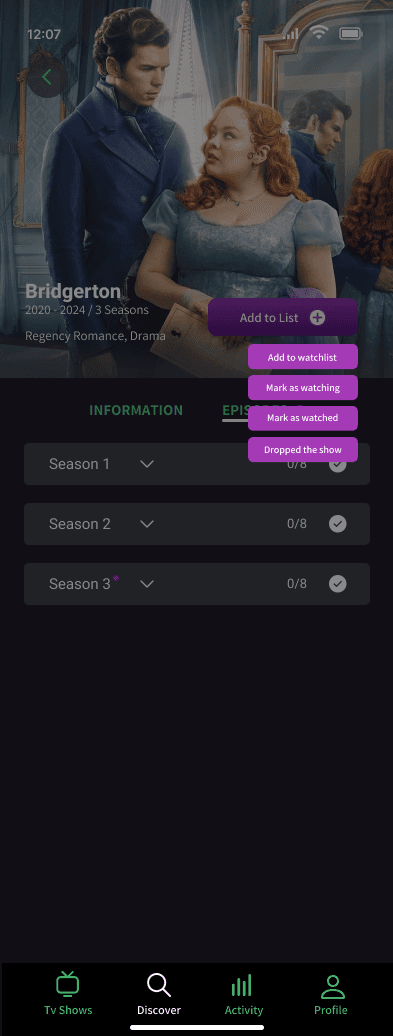
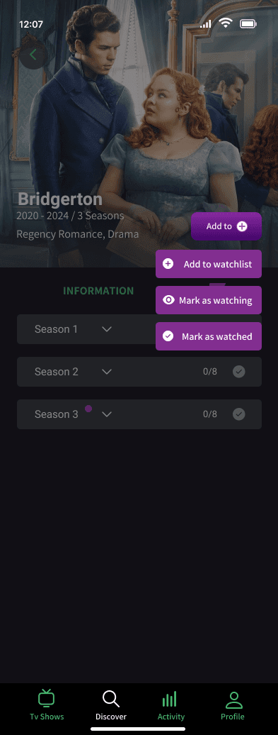
The show info page, which contains a lot of text and is crucial to the user experience, was redesigned for better readability. Text size, photos, and buttons were enlarged for easier visibility. Icons were added to the drop down menu to help users easily distinguish between actions, and the purple dot was replaced with a “new” flag for clarity.
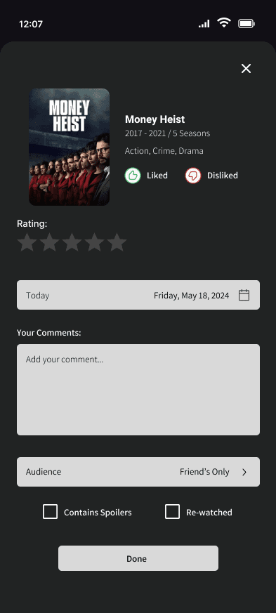
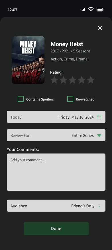
Review Changes
Users voiced having both the like/dislike buttons and star ratings was unnecessary. I also rearranged the hierarchy of the page to ensure the check boxes would be less likely to be overlooked.
Profile Changes
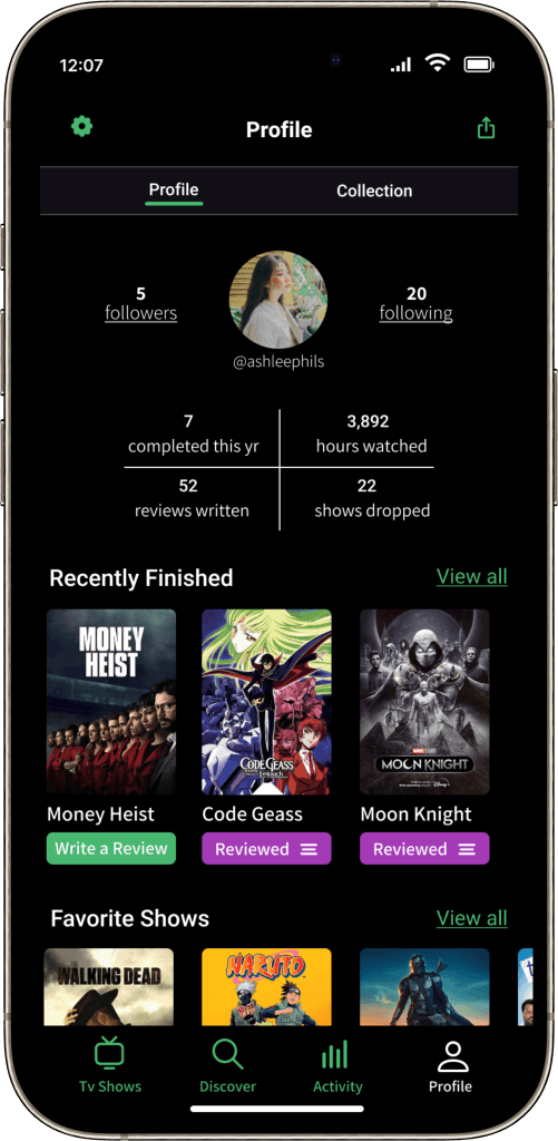
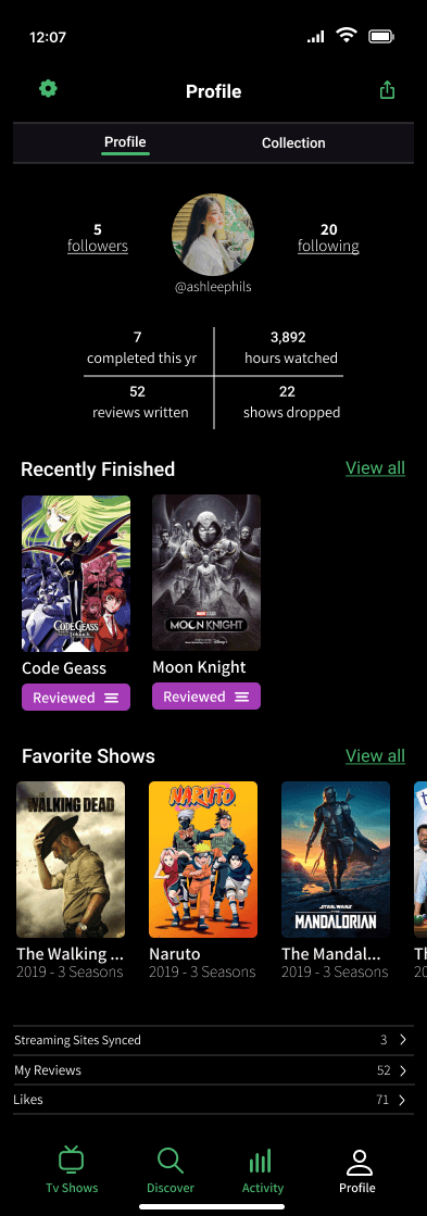
The function of the “Lists” tab seemed to puzzle users, leading to its removal in this version of the MVP. Plus, I reworked the four data boxes to reduce their button-like appearance and magnified both the font and visuals on the webpage.
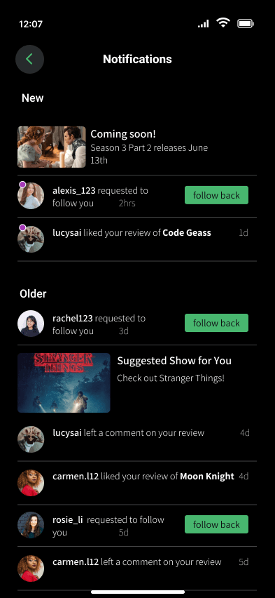
Activity and Notifications
I increased the sizing of the text since users found it to be incredibly small and hard to read. I also removed the “community” tab as it wasn’t fully developed and could be added in a future iteration. The main change was to the notification window, which was moved to it’s own page to increase legibility based on user feedback.
SHOW VAULT: THE FINAL PRODUCT!
Show Vault
For the passionate binge-watchers or casual viewers, Show Vault is a space for users to engage in conversation, share opinions, and find community with people who love the same series. Use the app as a personal record, write reviews, discover new shows and much more.
REFLECTIONS
I designed Show Vault with the intention of providing users a way to integrate streaming services into a single platform, allowing them to conveniently track their show progress and prioritize what’s next on their watch-list. Given the numerous entertainment options available today, addressing this issue was a particularly relevant topic and one that I’ve personally encountered as well. Hoping to ease decision paralysis and create an user-friendly app that television lovers would enjoy, I designed SHOW VAULT.
There were so many ideas I wanted to implement into the MVP but due to time constraints I had to focus on building the foundation of the app. In a future iteration there are more even more features that I would like to add.
What I Learned
Don’t Forget the Foundations of Design!
Over the course of the project, there were many deliverables that needed to be done that it was easy to get wrapped up and forget the basics. It is important to make sure my designs are consistent, legible and accessible for all users. It was through doing multiple rounds of user testing which allowed me to get useful feedback for my iterations and grounded me back to my design foundations.
Struggles
Don’t be Afraid to Back Up my Design Choices
With designing there are multiple ways to solve user problems. Throughout the project I would receive different opinions from other designers, potential users, and my mentor. Especially when questioned about my decisions, I needed to be able to back up my design choices. I learned that even if someone questions you about a choice doesn’t mean that it’s wrong. They might just be curious and want to know what led you to make that choice. Completing the MVP for this project helped me learn to be more confident as a designer.
Getting too caught up in the logistics
It was easy to get ahead of myself, thinking I needed to have everything figured out. This stumped my progress and made me believe my product needed to be PERFECT from the get go
Prioritizing what needed to be done for the MVP
After the initial features I thought of, I began to add more throughout the iterations. It was easy to keep wanting to add MORE to the product while working on it. I caught myself needing to cut back on certain implementations, saving it for future iterations.
How to advertise Show Vault to users who aren’t subscribed to any streaming services
While working on the product, I realized I wasn’t keeping this audience group in mind. I wondered if my app was self explanatory enough for users to also know how to manually track themselves
Features to Add:
WATCH PARTY
Way for users to watch the same show “alongside” their friends at their own pace. Users will be able to see their friend’s progress, leave comments and reactions that are revealed for each other once they get to the same spot.
JOURNAL
Where users are able to leave personal notes for a specific episode, season or series that they will be able to look back on. Serving as reminders for how they felt or thought about when first watching the show
ACHIEVEMENTS / BADGES
Gameifying the experience for the users. Unlocking achievements when completing a certain amount of shows or interacting with other users and etc. Hoping to make the app fun and have users look forward to interact more.